NOTES ON SMOKE FIGURES:
Two figures, one for heavy smoke and one for moderate smoke. In both cases the contours indicate the number of days with smoke overhead (based on a daily afternoon satellite image from the NOAA-11 polar orbiting meteorological satellite). The gray background areas indicate the areas for which smoke was detected overhead on at least one day. The analysis includes the period during the war, as well as for the rest of the year until the oil fires were extinguished.
"Heavy" smoke is identified as areas of smoke that are dark enough to obviously obscure the surface (easy to spot), while "moderate" smoke corresponds to the visible boundaries of the smoke plume (somewhat subjective). Both analyses are based on hand analyzed images, one from each day of the year. Days with cloud cover that obscured the smoke were excluded from the analysis, but there weren't very many of these days, except during the war. The summer is quite clear over the Arabian Peninsula. The smoke is quite difficult to identify (even using multi-spectral data) over the Indian Ocean, the Gulf, and the Red Sea, so there is likely to be some bias toward closed contours over the Arabian Peninsula.
The smoke coverage bar graph is a plot of data points where smoke was visible on a satellite image, the heavy smoke is represented by black bars and the moderate smoke by white bars.
Files were created at NCAR by DR. David Johnson & Todd Edmands.
| Moderate Contour Figure GIF | 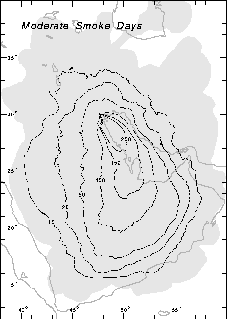 |
| Heavy Contour Figure GIF | 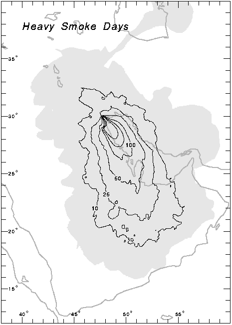 |
| Smoke Coverage BAR GRAPH GIF | 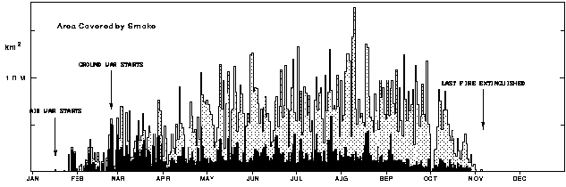 |
Both contour figures are part of a draft article to be submitted to Geophysical Research Letters.
For additional information contact RAF.
Images


